.•†•.
FOREIGN IN A DOMESTIC SENSE
•.†.•
An Inquiry by J. S.
“Constructed as ‘foreign in a domestic sense,’ Filipino America is a simultaneously
inassimilable and assimilable vestige of American colonialism,
producing a very different notion of geographical and imaginary boundaries between the colonizer and the colonized. [...] I am proposing that we think of ‘foreign in a domestic sense’ as a framework for thinking about the contradictory positionality
of the colonized Other, one that is quite different from the metropole–colony binary dominating postcolonial studies.”
—Sarita Echavez See, The Decolonized Eye
Filipino graphic design often does not utilize forms of ABSTRATION. These designs stand on their own, and attract attention from Western audiences for how on the surface level, they are repulsive or abject. They are the epitome of Bad Design. Though, upon closer inspection, a “trained” Filipino eye can understand the intricacy, value, and history behind such design choices. Though it may seem like there is no reasoning behind any design decision, Filipino design vernaculars are heavily informed by our everyday culture, as well as our legacy of American and Spanish imperialism. I argue that Filipino graphic design—all the way from the streets up to the most respected advertising agencies—is too quickly dismissed as Uninformed or Bad. For if we are to understand the roots and lineage of these designs, we understand that they are successful in their own local setting; they are not to be pulled out of their context and fetishized or ridiculed by the untrained & colonizing Western eye. This is what makes Filipino graphic design FOREIGN IN A DOMESTIC SENSE.
![]()
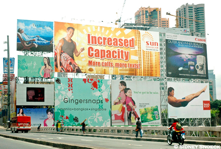
A block of billboards on EDSA North, a major roadway in Metro Manila. Photo by Sidney Snoeck.
The term “FOREIGN IN A DOMESTIC SENSE” originates from the 1901 Downes v. Bidwell Supreme Court case, questioning whether the newly colonized countries (Philippines, Puerto Rico, Guam, and the Carribean Basin) were to be considered “incorporated” into the United States or not.1 The case primarily questioned if Filipinos, for example, were considered domestic U.S. citizens or “international aliens.” In the final ruling, the Supreme Court declared that the new colonies were “inhabited by alien races” and thus could not be governed “according to Anglo-Saxon principles.”2 These territories were therefore considered “foreign to the United States in a domestic sense.”3 From the very beginning of U.S. colonial rule of the Philippines, Americans never considered Filipinos — an “alien race” — as equal. In this dehumanization of the Filipino, the U.S. Supreme Court crafts the intentionally vague phrase “FOREIGN IN A DOMESTIC SENSE.” The interpretation of this loosely-defined government ruling can vary depending on the reader; the U.S. Government, for example, could decide just how foreign and just how domestic the Philippines is depending on context. The Philippines is seen as domestic when discussing economic gain, but foreign when funding the U.S. Military occupation of the Philippine islands and people. Filipinos were foreign enough to Americans to legitimize their dehumanization, but were conveniently domestic in how their physical territories allowed for the growth of the U.S. Colonial empire. Purposeful DIS/RE/ARTICULATION✦ meets laws of the U.S. Colonial Empire. I must point out that as graphic designers, we, too, are constantly interpreting (graphic) laws. Therefore in the DIS/ARTICULATION of the actual meaning of “FOREIGN IN A DOMESTIC SENSE,” we are also able to RE/ARTICULATE the term into one that is representative of post/colonial Filipino graphic design and broader Filipino culture seen today.
![]()
Century Tuna advertisement featuring Derek Ramsay and Anne Curtis.
Viewed from a Western perspective, Filipino graphic design is similarly foreign in how it never quite seems to align with Western Graphic Design expectations or rules. Even large billboards with heavy amounts of text and imagery “lack the use of a simple grid system.”4 Yet, it is simultaneously domestic to the United States in how our current vernaculars have been heavily dictated and influenced by U.S. occupation. A billboard advertisement for Century Tuna is an entertaining specimen in showcasing our FOREIGN/DOMESTIC Filipino graphic design. The copy & posture of the models are clearly a link to the American “I Want You” recruitment poster, demonstrating how the continued U.S. Military presence in the Philippines has been widely accepted and even made its way into mainstream advertising.† The billboard is mostly grounded in centered text and symmetry. The interesting (lack of) choice of fonts as well as its (lack of a consistent) typographic composition would make most Western designers believe this is “Bad” (or FOREIGN) Graphic Design. Yet it still feels DOMESTIC in its choice of light-skinned Mestizo/a models‡ and link to U.S. Military recruitment campaigns. This proximity to whiteness and American ideals makes this poster feel almost familiar to American design vernaculars while simultaneously showing the effect of colonization of Filipino beauty standards. Century Tuna, similar to GlutaMAX, is feeding on the post/colonial Filipino’s internalized colonized ideals for the sale of a product (Thanks, America!)
![]()
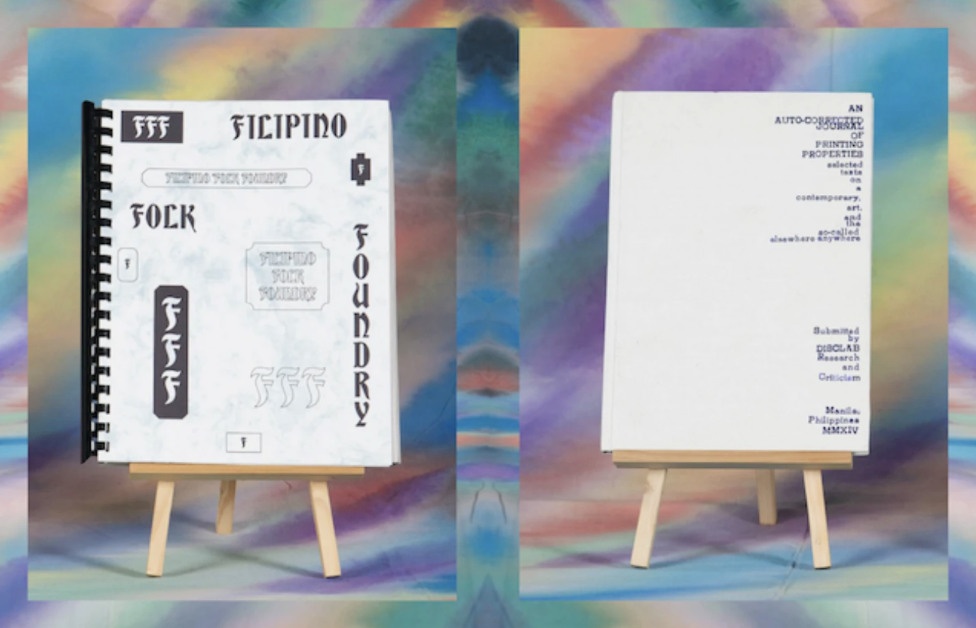
Filipino Folk Foundry front cover, image by Hardworking Goodlooking, for AIGA Eye on Design.
Beyond capitalism, I believe that this FOREIGN IN A DOMESTIC SENSE framework.⁑ allows Filipino graphic design to insert itself, whether understood or not, into Western (and more particularly U.S.) settings. I view this act as de/colonial in its ability to loudly challenge the Western canon of Graphic Design. The Filipino Folk Foundry (FFF), published, written, and designed by the Filipino/Diaspora group Hardworking Goodlooking is a prime example of this. FFF explores the local typographic vernaculars primarily in Metro Manila and investigates the foundations of post/colonial Filipino graphic design. As this field is not fully understood or formally studied in the Philippines, the FFF is radical in its approach of being one of the first proper documentations and writings on the state of Filipino graphic design and typography. It is also de/colonial in Hardworking Goodlooking’s act of self-publishing the work. Clara Balaguer, a writer for the book, notes that “by refusing to see cottage industry printing mechanisms as less valuable, by refusing to see error and inconsistency as worthless, by refusing to acquiesce to global north/west standards of quality, [...] and refusing to accept our own invisibility in the printing sector as an non-commutable sentence… This is how we decolonize.”5 Although the book did not get major traction in the Philippines (again, likely due to the lack of formalized study on graphic design), it made its rounds in media coverage in the United States. Several publications applauded Hardworking Goodlooking for how the book’s final form was “produced at local Risograph studios and bound in low-cost ways with a balance of skill and immediacy,”6 bringing forth the “most DIY production values.”7 Balaguer and Kristian Henson (a Filipino American graphic designer who worked on the FFF) had the opportunity to speak in several museum and university settings to address the actual content of the book. Even though the voices of these Filipino/American artists are finally being heard in the Western setting, I find that the FFF’s overall presence in the U.S. is tied directly to the book’s form. The continued Western fascination of form over content has allowed the distinctly Filipino piece of graphic design to be valued and discussed in the U.S., even if it is not completely understood. It is humorous to consider that the rise of the FFF’s coverage converged with the Western reinvigoration of interest in the Risograph machine. RISO printing in the Philippines is one of the most common ways to quickly and cheaply print posters, flyers, publications, and newspapers. The imperfections due to this printing method are not necessarily valued, but are nonetheless accepted if no other alternative is available (due to budget issues, for example). Up until recently in the West, the RISO was put aside due to the rapid advancement of more accurate and less error-prone laser and inkjet printers. The supposed nostalgia and inconsistencies facilitated by the RISO led to its resurgence in the U.S. in around 2016,8✴ which contributed to the popularity of the FFF. This is likely why even though FFF was first published in 2014, it wasn’t until 2017 that the book was covered by U.S. media. Even if the book’s content may not be fully appreciated by American readers, it is still powerful in its role of questioning the current state and trajectory of Western Graphic Design.
![]()
![]()
Photo of Bad Student's RISO Print Wall in their Manilia Studio, and their Manilia Studio. Taken from @_badstudent on Instagram.
Prior to 2016, RISO printing in the Philippines was always considered “cheap” and therefore undesirable if a project had access to a larger budget. The Filipino desire for always having the most expensive things manifested itself in our valuing for inkjet and laser printing; methods that did not overtly show the inherent flaws of graphic production. The widespread purposeful use of RISO printing (and therefore the acceptance of the flaws that accompany it) as a “trendy” graphic and illustrative aesthetic in the Philippines only happened after the Westren revival of the machine. This exemplifies how the West often dictates what should and should not be valued. In this case, the mainstream Philippinie design community did not see the desirability and value of RISO printing until the U.S. began to "rediscover" and place commercial value on it. The re-framing of the RISO as a valid and artistic form of making has led Philippine studios like Bad Student, a Manila based RISO collective founded in 2017, to gain legitimacy and design “clout” both in the Philippines and in the U.S.. Clara Balaguer of Hardworking Goodlooking attributes this phenomenon to the A.A. Phillip’s theory of Cultural Cringe. Balaguer defines this as the phenomenon “by which the culture produced in an ex-colonial or colonial country is seen as inferior to that being produced in the colonial seat.”9 Similar to the RISO, Hardworking Goodlooking and their overall practice was not widely accepted by Metro Manila designers in their early days, with Balaguer noting that “it was difficult to get interest and support from the local design community. It was quite ironic that in order to establish a practice with some sort of visibility we had to travel elsewhere, be validated there, in order to be re-imported back home to be given some sort of legitimacy.”10 Through the framework of Cultural Cringe, we can understand FOREIGN IN A DOMESTIC SENSE from a new perspective. Local Filipino design communities cringe at the very things that make their work overtly Filipino (i.e., RISO printing, imperfections in production practices, lack of formalized design theory, etc.) — they cringe at the DOMESTIC. But once these DOMESTIC qualities are accepted and given legitimacy by a FOREIGN power, namely a previous colonizer, the DOMESTIC is revisited, reframed, widely reproduced and recontextualized as “Good” in the Filipino setting. The interplay between FOREIGN & DOMESTIC continues to affect post/colonial Philippines in how the valuing for our own culture must be legitimized by our colonizers before we are even able to see value in it ourselves. This is, too, the irony of my own graphic design practice. I often reflect upon how I would likely never have interrogated Filipino graphic design in the ways that I currently do had I never come to study at RISD in the first place. Exporting myself to the land of my colonizer to learn Good Graphic Design, only to re-import myself back to the graphic landscape of the Philippines with a new, decolonizing eye.
![]()
![]()
![]()
Series of Posters I designed in 2019 about Philippine-U.S. History.
Designs I have produced for class projects at RISD have, too, been considered FOREIGN IN A DOMESTIC SENSE. Once again referencing design work I created in 2019 about Philippine-U.S. History, I recount several comments during my critique (from both peers and professors) about how my Filipino designs felt familiar (DOMESTIC!) in how it looked like design vernaculars in the Western motorcycle industry. Though what my professor kept coming back to was the questioning of whether or not the designs were actually “Good.” To this professor, the designs seemed FOREIGN enough to Western Graphic Design principles to warrant my work as “Bad” graphic design.
As I move forward with creating post/de/colonial Filipino graphic design work, I now see the importance of striking a balance between the FOREIGN and the DOMESTIC. Looking back to one of my central questions for my RISD Graphic Design Degree Project that I wrote in November 2020 before beginning this research, I asked: “How can maximinimalism in Filipino design vernaculars be better understood, introduced, and accepted within non-Filipino settings?” In hindsight, this central question screams ASSIMILATION! This displays my internalized desire for my post/de/colonial work to be accepted by my colonizers—the desire for the harms and pains inflicted on the colonized subject to be understood by the colonizer. As important as it is to stay true to Filipino graphic design vernaculars, I believe there is value in grounding this work in what is considered “Good” Graphic Design “rules.” Though the act of CODE SWITCHING inevitably repeats the harms of colonialism, it is this very act of ASSIMILATION that may allow for Filipino graphic design to be properly critiqued and discussed in a Western setting. Even if the designs are to be considered “Bad,” the inclusion of familiar DOMESTIC Graphic Design principles will allow for discourse beyond unwanted comments of how the work could resemble a motorcycle jacket. In another sense, it feels disingenuous to attempt to transform Filipino vernaculars into “acceptable” “Good” graphic design. To prevent this insincere transformation, I challenge myself to stay true to the roots of Filipino graphic design, and to not ABSTRACT its form simply to make it palatable to Western audiences.
When creating and evaluating work in a “FOREIGN IN A DOMESTIC SENSE” framework, I believe that it is paramount for the artist to directly address America’s COLONIAL AMNESIA. In doing so, the post/colonial minority artist is able to directly speak to the colonizers of the West, and further push conversations regarding the history (and current politics) of America’s colonial empire.
A block of billboards on EDSA North, a major roadway in Metro Manila. Photo by Sidney Snoeck.
The term “FOREIGN IN A DOMESTIC SENSE” originates from the 1901 Downes v. Bidwell Supreme Court case, questioning whether the newly colonized countries (Philippines, Puerto Rico, Guam, and the Carribean Basin) were to be considered “incorporated” into the United States or not.1 The case primarily questioned if Filipinos, for example, were considered domestic U.S. citizens or “international aliens.” In the final ruling, the Supreme Court declared that the new colonies were “inhabited by alien races” and thus could not be governed “according to Anglo-Saxon principles.”2 These territories were therefore considered “foreign to the United States in a domestic sense.”3 From the very beginning of U.S. colonial rule of the Philippines, Americans never considered Filipinos — an “alien race” — as equal. In this dehumanization of the Filipino, the U.S. Supreme Court crafts the intentionally vague phrase “FOREIGN IN A DOMESTIC SENSE.” The interpretation of this loosely-defined government ruling can vary depending on the reader; the U.S. Government, for example, could decide just how foreign and just how domestic the Philippines is depending on context. The Philippines is seen as domestic when discussing economic gain, but foreign when funding the U.S. Military occupation of the Philippine islands and people. Filipinos were foreign enough to Americans to legitimize their dehumanization, but were conveniently domestic in how their physical territories allowed for the growth of the U.S. Colonial empire. Purposeful DIS/RE/ARTICULATION✦ meets laws of the U.S. Colonial Empire. I must point out that as graphic designers, we, too, are constantly interpreting (graphic) laws. Therefore in the DIS/ARTICULATION of the actual meaning of “FOREIGN IN A DOMESTIC SENSE,” we are also able to RE/ARTICULATE the term into one that is representative of post/colonial Filipino graphic design and broader Filipino culture seen today.

Century Tuna advertisement featuring Derek Ramsay and Anne Curtis.
Viewed from a Western perspective, Filipino graphic design is similarly foreign in how it never quite seems to align with Western Graphic Design expectations or rules. Even large billboards with heavy amounts of text and imagery “lack the use of a simple grid system.”4 Yet, it is simultaneously domestic to the United States in how our current vernaculars have been heavily dictated and influenced by U.S. occupation. A billboard advertisement for Century Tuna is an entertaining specimen in showcasing our FOREIGN/DOMESTIC Filipino graphic design. The copy & posture of the models are clearly a link to the American “I Want You” recruitment poster, demonstrating how the continued U.S. Military presence in the Philippines has been widely accepted and even made its way into mainstream advertising.† The billboard is mostly grounded in centered text and symmetry. The interesting (lack of) choice of fonts as well as its (lack of a consistent) typographic composition would make most Western designers believe this is “Bad” (or FOREIGN) Graphic Design. Yet it still feels DOMESTIC in its choice of light-skinned Mestizo/a models‡ and link to U.S. Military recruitment campaigns. This proximity to whiteness and American ideals makes this poster feel almost familiar to American design vernaculars while simultaneously showing the effect of colonization of Filipino beauty standards. Century Tuna, similar to GlutaMAX, is feeding on the post/colonial Filipino’s internalized colonized ideals for the sale of a product (Thanks, America!)
Filipino Folk Foundry front cover, image by Hardworking Goodlooking, for AIGA Eye on Design.
Beyond capitalism, I believe that this FOREIGN IN A DOMESTIC SENSE framework.⁑ allows Filipino graphic design to insert itself, whether understood or not, into Western (and more particularly U.S.) settings. I view this act as de/colonial in its ability to loudly challenge the Western canon of Graphic Design. The Filipino Folk Foundry (FFF), published, written, and designed by the Filipino/Diaspora group Hardworking Goodlooking is a prime example of this. FFF explores the local typographic vernaculars primarily in Metro Manila and investigates the foundations of post/colonial Filipino graphic design. As this field is not fully understood or formally studied in the Philippines, the FFF is radical in its approach of being one of the first proper documentations and writings on the state of Filipino graphic design and typography. It is also de/colonial in Hardworking Goodlooking’s act of self-publishing the work. Clara Balaguer, a writer for the book, notes that “by refusing to see cottage industry printing mechanisms as less valuable, by refusing to see error and inconsistency as worthless, by refusing to acquiesce to global north/west standards of quality, [...] and refusing to accept our own invisibility in the printing sector as an non-commutable sentence… This is how we decolonize.”5 Although the book did not get major traction in the Philippines (again, likely due to the lack of formalized study on graphic design), it made its rounds in media coverage in the United States. Several publications applauded Hardworking Goodlooking for how the book’s final form was “produced at local Risograph studios and bound in low-cost ways with a balance of skill and immediacy,”6 bringing forth the “most DIY production values.”7 Balaguer and Kristian Henson (a Filipino American graphic designer who worked on the FFF) had the opportunity to speak in several museum and university settings to address the actual content of the book. Even though the voices of these Filipino/American artists are finally being heard in the Western setting, I find that the FFF’s overall presence in the U.S. is tied directly to the book’s form. The continued Western fascination of form over content has allowed the distinctly Filipino piece of graphic design to be valued and discussed in the U.S., even if it is not completely understood. It is humorous to consider that the rise of the FFF’s coverage converged with the Western reinvigoration of interest in the Risograph machine. RISO printing in the Philippines is one of the most common ways to quickly and cheaply print posters, flyers, publications, and newspapers. The imperfections due to this printing method are not necessarily valued, but are nonetheless accepted if no other alternative is available (due to budget issues, for example). Up until recently in the West, the RISO was put aside due to the rapid advancement of more accurate and less error-prone laser and inkjet printers. The supposed nostalgia and inconsistencies facilitated by the RISO led to its resurgence in the U.S. in around 2016,8✴ which contributed to the popularity of the FFF. This is likely why even though FFF was first published in 2014, it wasn’t until 2017 that the book was covered by U.S. media. Even if the book’s content may not be fully appreciated by American readers, it is still powerful in its role of questioning the current state and trajectory of Western Graphic Design.
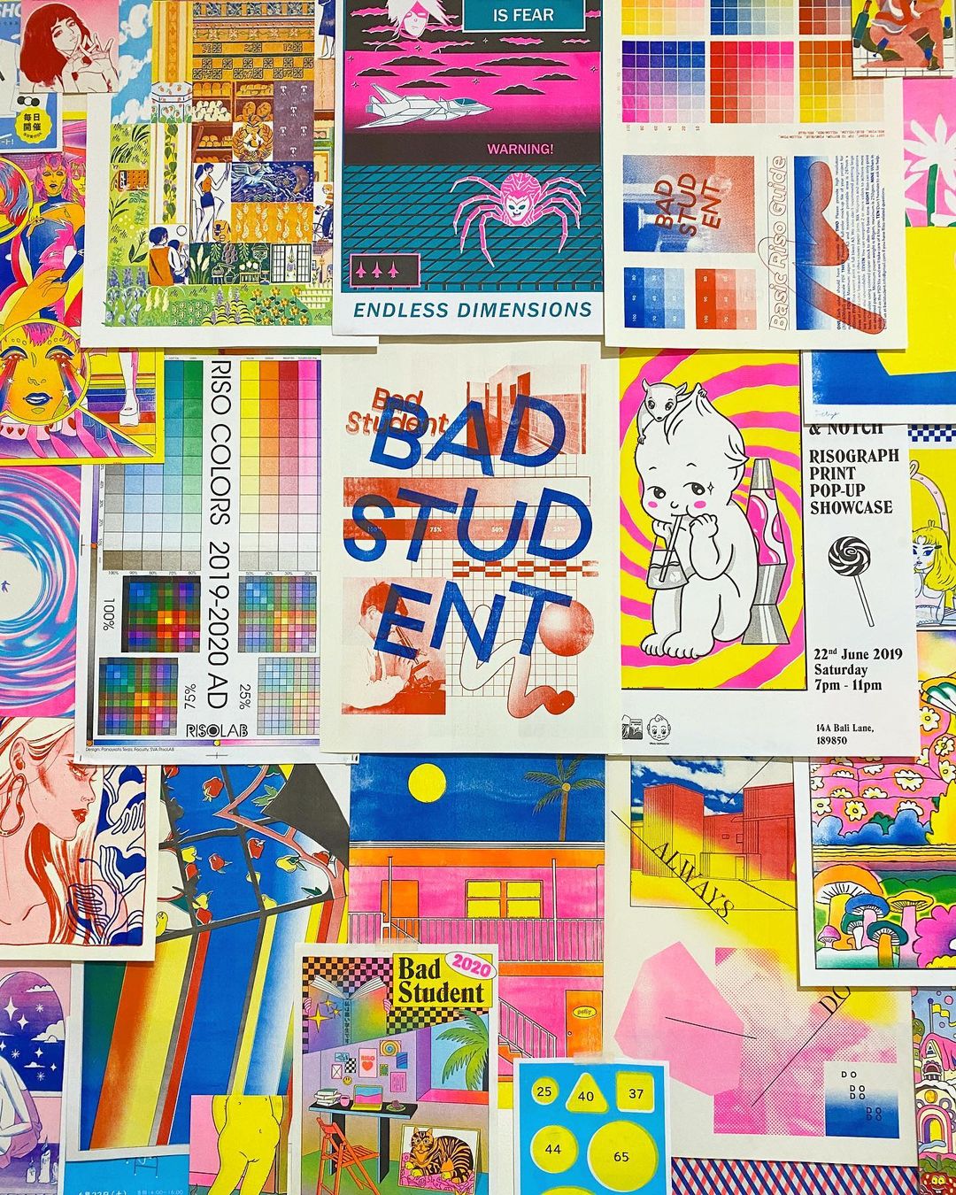
Photo of Bad Student's RISO Print Wall in their Manilia Studio, and their Manilia Studio. Taken from @_badstudent on Instagram.
Prior to 2016, RISO printing in the Philippines was always considered “cheap” and therefore undesirable if a project had access to a larger budget. The Filipino desire for always having the most expensive things manifested itself in our valuing for inkjet and laser printing; methods that did not overtly show the inherent flaws of graphic production. The widespread purposeful use of RISO printing (and therefore the acceptance of the flaws that accompany it) as a “trendy” graphic and illustrative aesthetic in the Philippines only happened after the Westren revival of the machine. This exemplifies how the West often dictates what should and should not be valued. In this case, the mainstream Philippinie design community did not see the desirability and value of RISO printing until the U.S. began to "rediscover" and place commercial value on it. The re-framing of the RISO as a valid and artistic form of making has led Philippine studios like Bad Student, a Manila based RISO collective founded in 2017, to gain legitimacy and design “clout” both in the Philippines and in the U.S.. Clara Balaguer of Hardworking Goodlooking attributes this phenomenon to the A.A. Phillip’s theory of Cultural Cringe. Balaguer defines this as the phenomenon “by which the culture produced in an ex-colonial or colonial country is seen as inferior to that being produced in the colonial seat.”9 Similar to the RISO, Hardworking Goodlooking and their overall practice was not widely accepted by Metro Manila designers in their early days, with Balaguer noting that “it was difficult to get interest and support from the local design community. It was quite ironic that in order to establish a practice with some sort of visibility we had to travel elsewhere, be validated there, in order to be re-imported back home to be given some sort of legitimacy.”10 Through the framework of Cultural Cringe, we can understand FOREIGN IN A DOMESTIC SENSE from a new perspective. Local Filipino design communities cringe at the very things that make their work overtly Filipino (i.e., RISO printing, imperfections in production practices, lack of formalized design theory, etc.) — they cringe at the DOMESTIC. But once these DOMESTIC qualities are accepted and given legitimacy by a FOREIGN power, namely a previous colonizer, the DOMESTIC is revisited, reframed, widely reproduced and recontextualized as “Good” in the Filipino setting. The interplay between FOREIGN & DOMESTIC continues to affect post/colonial Philippines in how the valuing for our own culture must be legitimized by our colonizers before we are even able to see value in it ourselves. This is, too, the irony of my own graphic design practice. I often reflect upon how I would likely never have interrogated Filipino graphic design in the ways that I currently do had I never come to study at RISD in the first place. Exporting myself to the land of my colonizer to learn Good Graphic Design, only to re-import myself back to the graphic landscape of the Philippines with a new, decolonizing eye.

Series of Posters I designed in 2019 about Philippine-U.S. History.
Designs I have produced for class projects at RISD have, too, been considered FOREIGN IN A DOMESTIC SENSE. Once again referencing design work I created in 2019 about Philippine-U.S. History, I recount several comments during my critique (from both peers and professors) about how my Filipino designs felt familiar (DOMESTIC!) in how it looked like design vernaculars in the Western motorcycle industry. Though what my professor kept coming back to was the questioning of whether or not the designs were actually “Good.” To this professor, the designs seemed FOREIGN enough to Western Graphic Design principles to warrant my work as “Bad” graphic design.
As I move forward with creating post/de/colonial Filipino graphic design work, I now see the importance of striking a balance between the FOREIGN and the DOMESTIC. Looking back to one of my central questions for my RISD Graphic Design Degree Project that I wrote in November 2020 before beginning this research, I asked: “How can maximinimalism in Filipino design vernaculars be better understood, introduced, and accepted within non-Filipino settings?” In hindsight, this central question screams ASSIMILATION! This displays my internalized desire for my post/de/colonial work to be accepted by my colonizers—the desire for the harms and pains inflicted on the colonized subject to be understood by the colonizer. As important as it is to stay true to Filipino graphic design vernaculars, I believe there is value in grounding this work in what is considered “Good” Graphic Design “rules.” Though the act of CODE SWITCHING inevitably repeats the harms of colonialism, it is this very act of ASSIMILATION that may allow for Filipino graphic design to be properly critiqued and discussed in a Western setting. Even if the designs are to be considered “Bad,” the inclusion of familiar DOMESTIC Graphic Design principles will allow for discourse beyond unwanted comments of how the work could resemble a motorcycle jacket. In another sense, it feels disingenuous to attempt to transform Filipino vernaculars into “acceptable” “Good” graphic design. To prevent this insincere transformation, I challenge myself to stay true to the roots of Filipino graphic design, and to not ABSTRACT its form simply to make it palatable to Western audiences.
When creating and evaluating work in a “FOREIGN IN A DOMESTIC SENSE” framework, I believe that it is paramount for the artist to directly address America’s COLONIAL AMNESIA. In doing so, the post/colonial minority artist is able to directly speak to the colonizers of the West, and further push conversations regarding the history (and current politics) of America’s colonial empire.
1 Doug Mack, “The Strange Case of Puerto Rico,” Slate Magazine, October 9, 2017. https://slate.com/news-and-politics/2017/10/the-insular-cases-the-racist-supreme-court-decisions-that-cemented-puerto-ricos-second-class-status.html
2 Supreme Court of the United States, “U.S. Reports: Downes v. Bidwell, 182 U.S. 244 (1901),” 287.
3 Supreme Court of the United States, “U.S. Reports: Downes v. Bidwell, 182 U.S. 244 (1901),” 341.
4 The Office of Design and Culture, Filipino Folk Foundry (Manila: Hardworking Goodlooking, 2014), 34.
5 Clara Balaguer, “Why Self-publishing is a ‘Decolonizing’ Act in the Philippines,” interview by Madeleine Morley, Eye on Design, AIGA, February 13, 2017. https://eyeondesign.aiga.org/why-self-publishing-is-a-decolonizing-act-in-the-philippines/
6 Billie Muraben, “Hardworking Goodlooking produce some hard-working, good-looking publications,” It’s Nice That, January 16, 2015, https://www.itsnicethat.com/articles/hardworking-goodlooking7 “Insights 2017: Clara Balaguer and Kristian Henson, Office of Culture & Design/Hardworking Goodlooking,” Walker Art Center, published March 21, 2017, https://walkerart.org/magazine/insights-2017-clara-balaguer-and-kristian-henson-office-of-culture-designhardworking-goodlooking
8 Emily Gosling, “Design With Limitations, How Graphic Designers are Harnessing the Rise of Risograph,” AIGA Eye on Design, August 17, 2016. https://eyeondesign.aiga.org/design-with-limitations-how-graphic-designers-are-harnessing-the-rise-of-risograph/.
9 Hardworking Goodlooking & Ulises, “Publishing as Practice,” streamed February 27, 2021 for the Printed Matter Virtual Art Book Fair. 2:05:18. https://youtu.be/f1Ic8Gtebbc?t=7518
10 Ibid
✦ The framework of DIS/RE/ARTICULATION is discussed in more detail in the the DIS/RE/ARTICULATION & COLONIAL AMNESIA section.
† Can this advertisement be considered as a form of propaganda supporting U.S. Military presence?
‡ These two celebrities are among the most popular in the Philippines. Derek Ramsay (left) is half British half Filipino, while Anne Curtis (right) is half Australian half Filipino. The last two Filipinos to win Miss Universe, Catriona Gray (British-Filipina) and Pia Wurtzbach (German-Filipina), are also Metizas. Filipinos have a fascination with mixed-raced Filipino celebrities, again showing the continued value for Mestizo/as in post/colonial Philippines due to their proximity to whiteness.
⁑ To my knowledge, this framework was first proposed by Sarita Echavez See in The Decolonized Eye.
✴ Anecdotally speaking, the allure with RISO Printing has dramatically risen in RISD since 2016, which even led to the Illustration and Graphic Design departments to acquire a RISO Printer in late 2017.
•.•¡•.¡.•. FRAMEWORKS .•.¡.•¡•.•
•. COGNITIVE JUSTICE .•
•. EROS IDEOLOGIES .•
•.ABSTRACTIONASSIMILATION, & CODESWITCHING .•
•. FOREIGN IN A DOMESTIC SENSE .•
•. DIS/RE/ARTICULATON & COLONIAL AMNESIA .•
•. GOOD BAD DESIGN, CREATIVE MISPRONUNCIATION, & MAXIMALISM .•
•. COGNITIVE JUSTICE .•
•. EROS IDEOLOGIES .•
•.ABSTRACTIONASSIMILATION, & CODESWITCHING .•
•. FOREIGN IN A DOMESTIC SENSE .•
•. DIS/RE/ARTICULATON & COLONIAL AMNESIA .•
•. GOOD BAD DESIGN, CREATIVE MISPRONUNCIATION, & MAXIMALISM .•
•. FRAMEWORKS .•
•. COGNITIVE JUSTICE .•
•. EROS IDEOLOGIES .• •.ABSTRACTIONASSIMILATION, & CODESWITCHING .•
•. FOREIGN IN A DOMESTIC SENSE .•
•. DIS/RE/ARTICULATON & COLONIAL AMNESIA .•
•. GOOD BAD DESIGN, CREATIVE MISPRONUNCIATION, & MAXIMALISM .•
•. COGNITIVE JUSTICE .•
•. EROS IDEOLOGIES .• •.ABSTRACTIONASSIMILATION, & CODESWITCHING .•
•. FOREIGN IN A DOMESTIC SENSE .•
•. DIS/RE/ARTICULATON & COLONIAL AMNESIA .•
•. GOOD BAD DESIGN, CREATIVE MISPRONUNCIATION, & MAXIMALISM .•