GOOD BAD DESIGN, CREATIVE MISPRONUNCIATION, & MAXIMALISM
An Inquiry by J. S.
“Filipino graphic design is as over-crowded as the landscape of our country, which has the region’s second-highest urban population density rate. Here, minimalism can be understood as a sign of poverty, only surfacing when the designer does not possess enough technical or financial prowess for the addition of borloloy (lavish ornamentation), and fills the gaps with decorations that cost time and signify money.”
—Clara Balaguer, Tropico Vernacular
Whether intentional or not, Filipino graphic design challenges Eurocentric Graphic Design in almost every formal quality, but most notably through its excessive, over-the-top use of ornamentation. The borloloy (lavish ornamentation) observed in many Filipino designs can be partially attributed to the contemporary Filipino’s desire to make pakyaw, sulit, and tawad. Pakyaw literally translates to “wholesale,” and is the concept of quantity over quality. The Filipino has an obsession in believing that More is More, even if you would benefit from having less. To be able to make-pakyaw is to make-yabang (show off) to your circle that you own More just because you can. I have had many conversations with my lola (grandmother) about her collection of Longchamp and Louis Vuitton handbags. The entire family knows that 70% of that collection is fake—counterfeit products produced in China and sold by local Filipinos—despite my lola insisting that her collection is so large (and original!) because she was able to make tawad (bargain) with her favorite seller. A part of me thinks my lola knows that her bags are fake and not actually “overruns” that her seller has convinced her they are. Yet none of us (and none of her friends) really challenge her once she defends the authenticity of her collection. When making pakyaw, the goal is ultimately to show that you have More, for not having More directly implies you have less. If one was to seriously question someone else’s pakyaw, that would also lead to a decrease in the value of their very own collection—so what’s the point of having More if no one else values it?
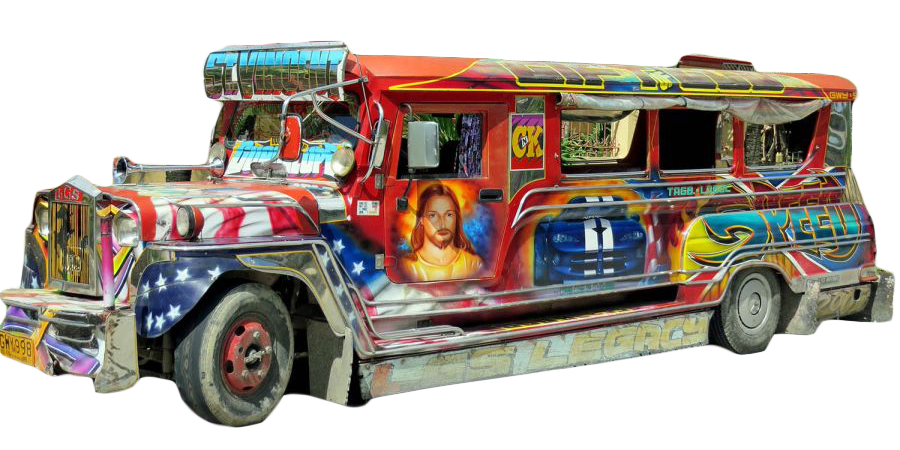
Jesus/America themed gas-powered Jeepney. I could not find a Jeepney more representative of how post/colonial Philippines is, in many ways, still colonized.
Jeepney drivers and sign painters are no strangers to making pakyaw and sulit. Jeepneys littered across Metro Manila are hardly ever bare. Sign painters are often commissioned to cover entire jeepneys1 and will not be paid until every inch of the vehicle is covered. Once again, ornamentation plays a vital role for both the jeepney driver and the sign painter. To overly ornament the jeepney is to make it more desirable to potential local customers, and thus allow the jeepney driver to make a living wage. To foreigners and tourists, the painted jeepney looks nothing like the public transit vehicles they are used to. This evokes a sense of exoticism that makes the run-down (but painted!) jeepney a desirable “must-try” on a list of tourist attractions. A bare jeepney looks cheap in revealing the thin metal sheets it is made of. But a painted jeepney? Now that looks expensive (even if everyone knows that it isn’t). In this special relationship between jeepney driver and sign painter, the painter is able to make pakyaw in a promised and loyal customer base. In the recent technological advancements that are pushing for the use of more modern and eco-friendly electric powered jeepneys,2 or E-Jeepneys, sign painters are still hired to ornament these vehicles. Even if the actual form and underlying structure of these new E-Jeepneys are completely different from the original jeepneys that Filipinos know and love, sign painters are hired to transform these E-Jeepneys to look like their old jeepney counterparts. Eventually, E-Jeepneys had to be differentiated to be seen as more desirable and expensive. Ironically, these E-Jeepneys now come off as the “minimalist” version of their gas-powered & polluting counterparts. The overall paint-job is cleaner, less intricate, less complex—less ornamented. Minimalism (in a Filipino sense, meaning not actually that minimal) is once again used for the sake of capitalism. Once E-Jeepneys have been established as the better alternative, they can take on their own visual vernaculars that both speak to the original jeepney but feel more expensive. Selling the E-Jeepney to Filipinos also relied on the devaluing of the jeepney. Rehim Panes, when reporting on the introduction of the first E-Jeepney fleet, rationalized its necessity by claiming that there was a “rampant increase of old, dirty and smoke-producing jeeps.”3 The internalized colonization of the Filipino once again shows itself in the tossing of the old for the new—we must replace the “dirty” with the “clean,” even if this means potentially disregarding and DISARTICULATING the cultural importance of the original jeepney.✶

The new e-jeepneys are now becoming more commonplace throughout Metro Manila.
The values of making pakyaw also show themselves across billboards and advertisements in Metro Manila. Agencies and corporations love to buy out major concentrated advertising spaces, even if that means printing very similar billboards right next to one another. If one was truly to make pakyaw when selling their product, they must make sulit in this pursuit.
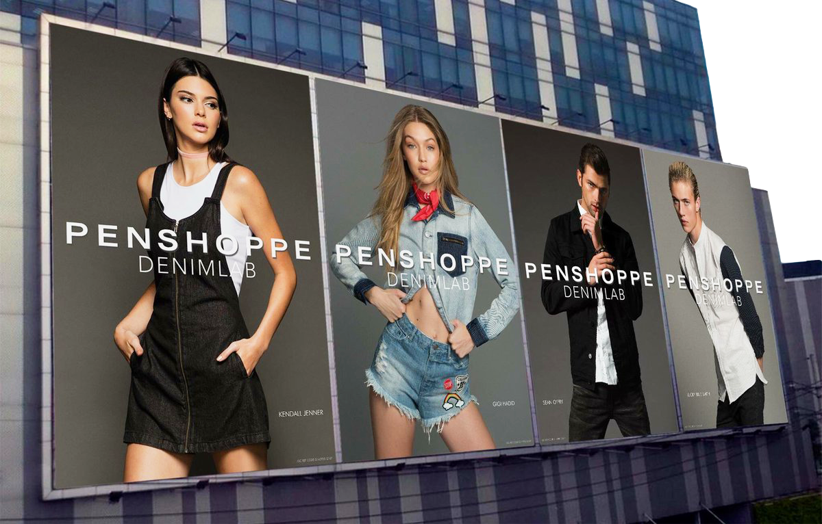
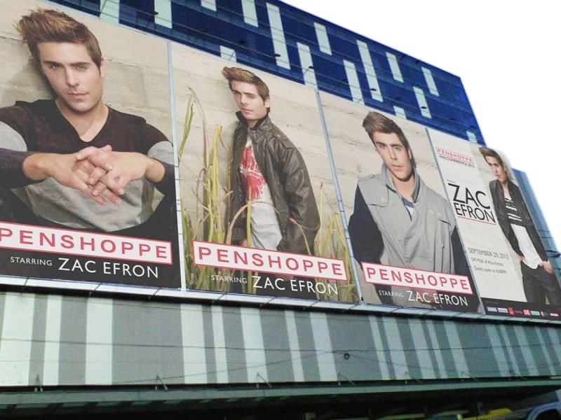
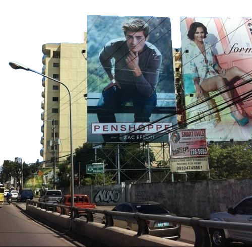
Dedicated advertising space for PENSHOPPE, a clothing brand well known for “importing” celebrities. Although this spot typically includes multiple celebrities, Zac Efron’s popularity warranted the use of all four billboards for images of just himself.
To make sulit is to make the most (often financially) of a situation. In the cases of Penshoppe and Bench, they make sulit and pakyaw in their large scale advertising campaigns that feature prominent international celebrities. Though these advertising spaces may feature more than one celebrity, this is not always the case, especially when the talent is as popular as Zac Efron. In 2012, Penneshop hired Zac Efron for a series of billboard advertisements. With his overwhelming popularity in the Philippines, Efron took up all four of Penneshop’s most prominent billboard spaces. In true sulit fashion, Penneshop took it one step further and hosted a Zac Efron Fan Conference. Even if advertising space is limited, these billboards are swapped out every so often with another photo from the same shoot, as demonstrated by the billboard of Zayn Malik on the C5 Roadway, which many Filipino Zayn fans now call the “Zayn Billboard.”3 Both Penneshop and Bench have learned since then on how to make More out of these celebrity shoots. Everytime a new international celebrity or model is hired for a campaign, major news networks cover their impending visit, with swarms of fans anticipating the chance to meet them. I remember my days in middle and high school, when my classmates would make kwento (gossip) all day in the anticipation for the release of the next big Penneshop billboard. The dependence on these prominent celebrities allows for these billboards to rely significantly less on graphic design principles. As these are arguably the most successful advertising campaigns in contemporary Metro Manila, smaller corporations and advertising agencies look to these billboards as prime examples of successful—or even Good—graphic design. A majority of these billboards do not have a grid system (because they don’t need one!), and almost exclusively rely on a centered composition & text. Though you may be tempted to think of this as “minimalism,” I argue that it is minimal only because of the lack of a need for much design in the first place. At this point, most Filipinos already know what Penneshop and Bench are—they do not care if the typographic treatment of their logo appears different every year. They are here to see the photo!
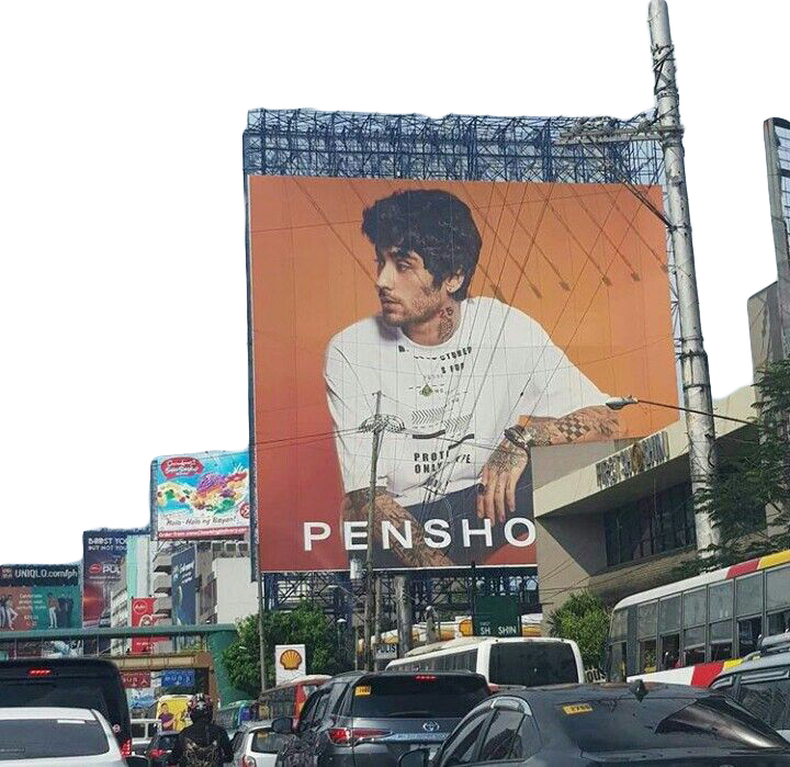
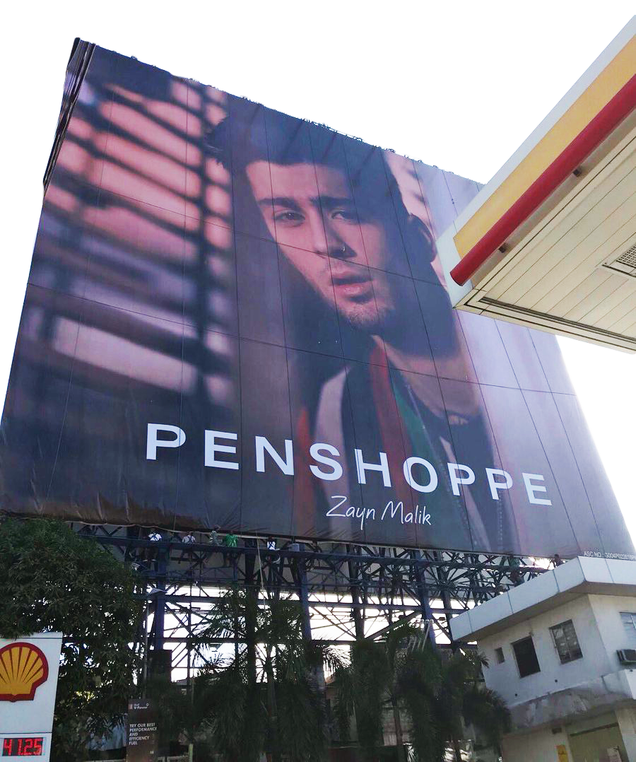
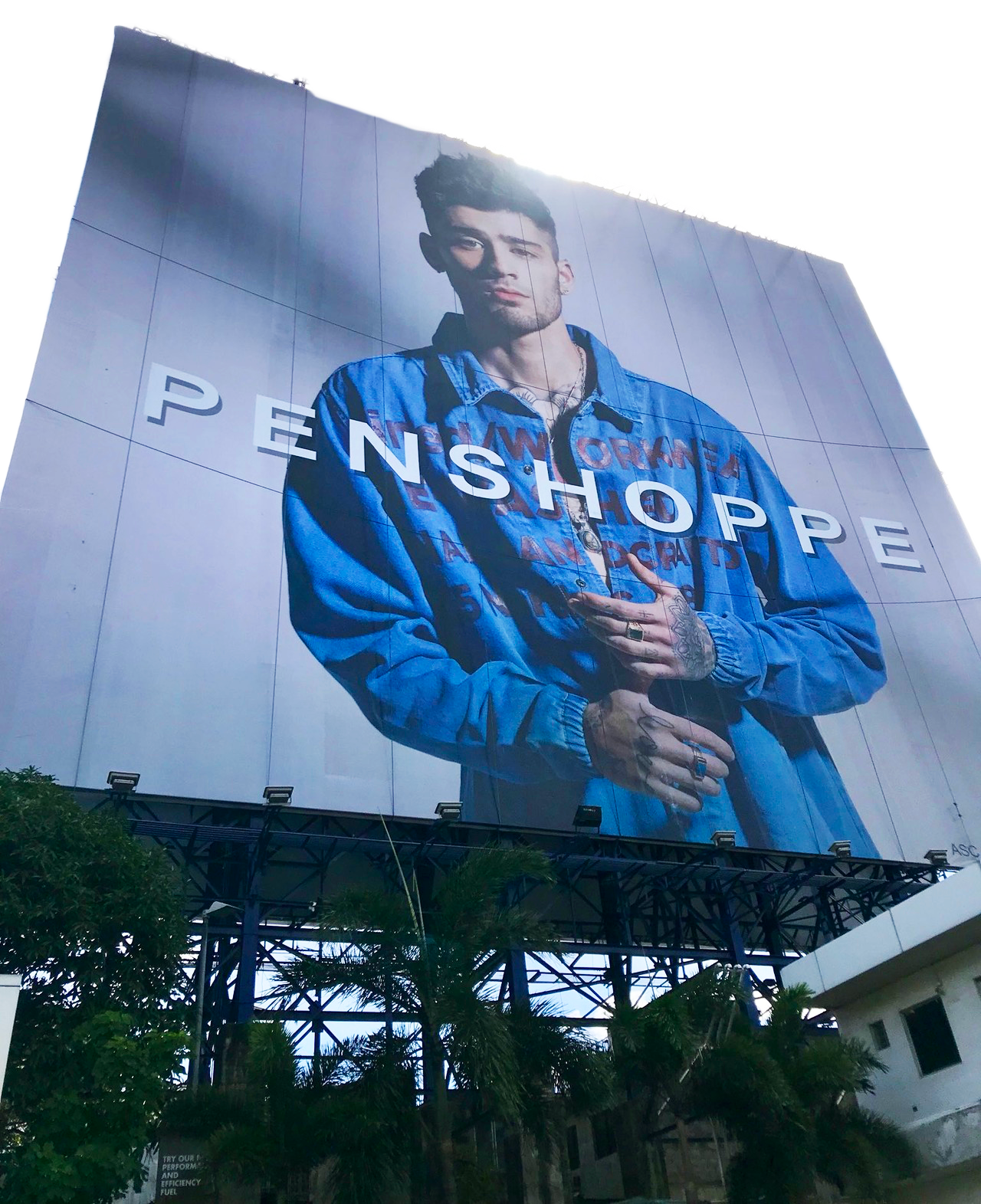
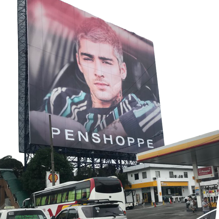
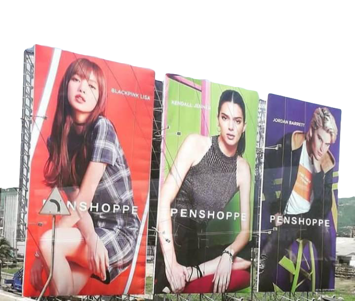
As observed in the images above, prominent companies tend to own blocks of advertising space. It has become customary to produce entire advertising campaigns for these spaces alone. Though these spaces hardly get filled by other corporations, they are almost immediately taken if the chance arises.

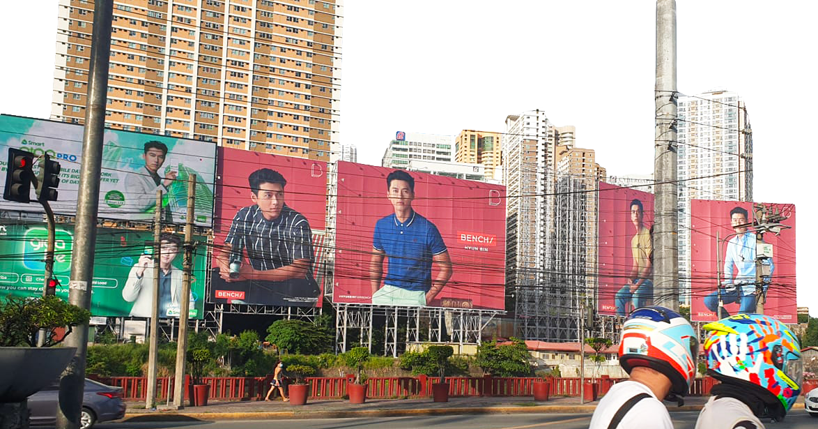
Bench, another popular clothing brand that features foreign celebrities in their advertisements. This set of billboards are placed along one of the busiest parts of EDSA (a major highway in Metro Manila). The Filipino fascination for Mestizo/a and Western continues today, but the rise of K-Pop in Philippine mainstream culture has caused Bench and many other Philippine companies, like Smart, to now include these Korean stars in advertisements instead
of white celebrities. It is still worth mentioning, however, that these Korean celebrities further perpetuate patterns of shadism and colorism in post/colonial Philippines. Our fixation on lighter skin still shows itself, even in our choice of Korean Pop and Drama stars.
This has contributed to what Lobregat Balaguer has termed CREATIVE MISPRONUNCIATION.4 As discussed previously, designers in the Philippines tend to lack creative agency. Designers do hold an important place in producing design outputs, but graphic design is still mostly perceived as a trade skill. The inevitable conclusion is the Graphic Designer’s biggest nightmare—they must listen to their naive client (or even creative director) who bases their understanding of graphic design on the current state of the Philippine advertising scene. Though references may be pulled from the West, the lack of the designer’s voice (or rather, the DISARTICULATION of their voice) leads to “atrocities [...] committed on highly-visible design products such as billboards. Because major advertisers commit amateur design mistakes, including but not limited to irregular kerning, overly wide leading, typeface confusion, and the heavy-handed use of extreme drop shadow, smaller advertisers and designers believe that these things are normal, even desirable, and so design illiteracy is perpetuated.”5 In Balaguer’s classification of this as “design illiteracy,” we can understand the output of CREATIVE MISPRONUNCIATION as the Filipino designer’s attempt at REARTICULATION. The lack of the designer’s voice and formalized understanding of Graphic Design principles demonstrates their lack of eloquence in explaining or defending their design decisions and ideas. Balaguer’s choice of defining these unintended outputs as “atrocities” demonstrates how even Filipinos studying our local design scene compare our work to Western standards. Yes, “irregular kerning, [and] overly wide leading” are concepts that even a first year Graphic Design student in the West would see as “wrong.” But, if these “mistakes” are functional, accepted, and widely repeated within the Filipino setting, would it still be considered an “atrocity,” or would it be considered successful in how its form follows function?

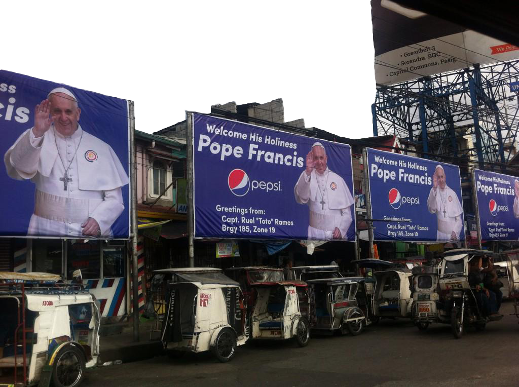


the model, then (hectically) place the accompanying info around said model.
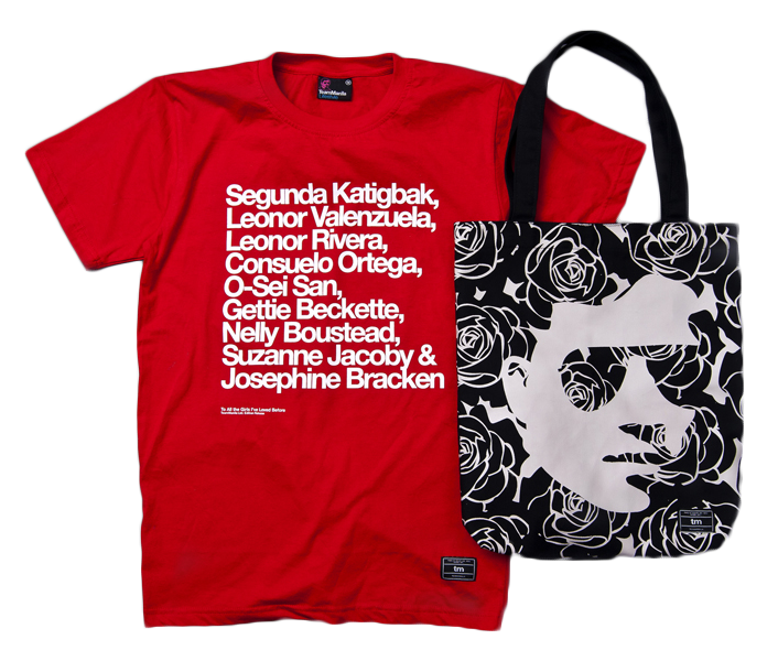
The perpetuation of these CREATIVE MISPRONUNCIATIONS likely link to the lack of Western design fluency and theory in the Philippines. Because we do not have our own Filipino graphic design theory, we must look to the West—namely, our colonizers (Stockholm Syndrome!)—for some type of formal & theoretical grounding. This is likely why most Filipino graphic designers are not given complete agency unless they are educated in a top Philippine University, or (really, anywhere in) the United States. Team Manila, founded in 2001, was one of the first fully dedicated Philippine Graphic Design Studios (that is, not directly tied to an advertising agency). Founded by Jowee Alviar, MFA Graduate from the CalArts Graphic Design Program, and Raymund Punzalan, Team Manila began to push the field of graphic design in the Philippines. They quickly rose to fame mostly due to the production of their nationalistic Filipino merchandise,6 and thus played a large role in the influx of new small graphic design studios across the country. Filipino graphic design continues to grow and become more valued by Filipinos. Yet our lack of formalized and RE/ARTICULATED design theory still leaves the Filipino designer without a lengua (tongue, language). Sans-lengua, clients have continued power over the designer to produce “atrocities,” and the West may continue discounting Filipino graphic design as “Bad.”

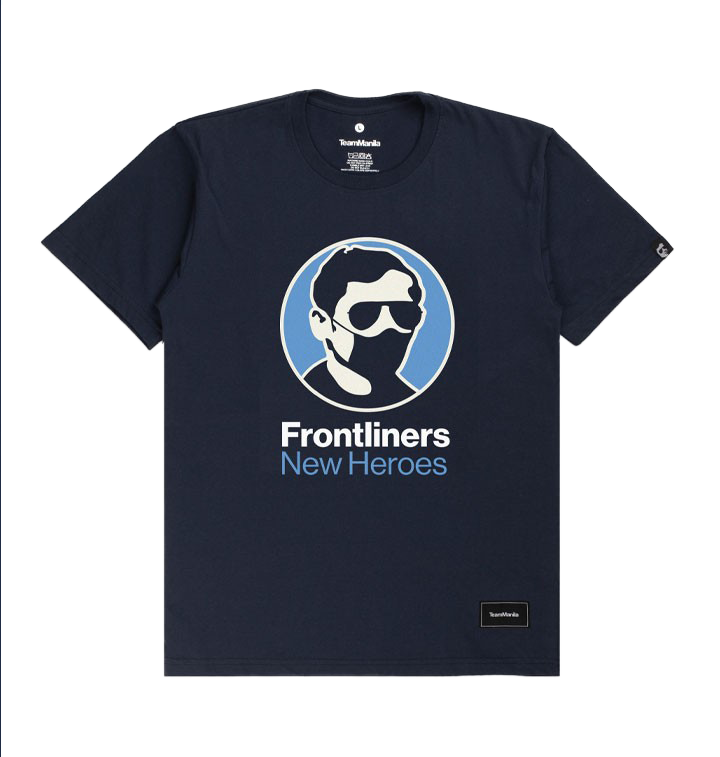
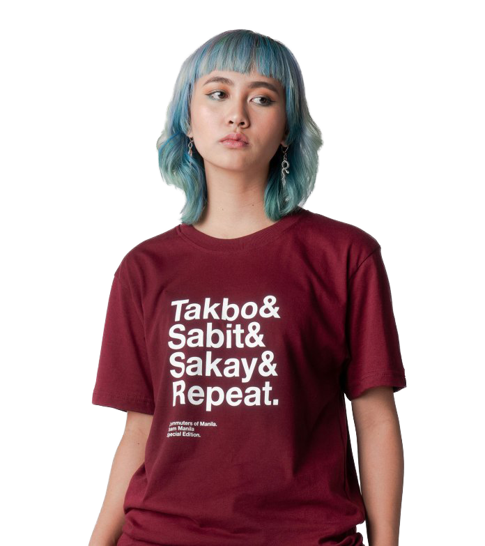


Our CREATIVE MISPRONUNCIATIONS even bleed into our language. Revisiting the Pearl/Perlas duality, I view the translation of the colonizing term “Pearl of the Orient” to the Filipino “Perlas ng Silanganan” as the Filipino’s attempt at REARTICULATING their own nationalistic pride. By translating the fetishistic English term to a Filipino term and incorporating it in our national anthem, many Filipinos now do not interrogate what it really means to call our country the Pearl of the Orient. The CREATIVE MISPRONUNCIATION of our Filipino Pride as a Perlas therefore forces us to always c/overtly frame and see ourselves in the lens of the colonizer. The “Pearl of the Orient” is a difficult phrase to reclaim, whether it be in English or Filipino. For the “Orient” was and continues to be a construct created by the West for the framing of the East as “exotic” lands that must be conquered and explored. I see Perlas ng Silanganan as the Filipino’s and my own attempt at REARTICULATING our country’s culture and history as one being tied to colonialism but still in its early de/post/colonial period of evolution. Given the purposeful DISARTICULATION of pre-colonial Filipino languages and culture, the CREATIVE MISPRONUNCIATION of the Philippines as the Perlas ng Silanganan will work for now as we continue to grow and interrogate our Filipino culture sans-colonial rule. Even if somewhat problematic, I still see value in the reclamation of the term Perlas ng Silanganan, as it is the continued reminder that de/colonization is only possible when interrogating the legacies of colonization.
The Filipino’s design illiteracy may be humorous to formally educated graphic designers from the West, but I am more interested in this CREATIVE MISTRANSLATION—how designers in post/colonial settings interpret colonized vernaculars. Without the formal recognition of the artistic importance, influence, and agency behind graphic design, Filipino designers are given, in some sense, the freedom to operate without the bureaucratic, formal, or corporate structures and expectations of the West. Filipino graphic design is seen as too ornamented, too colorful, too much—clearly linking to our culture of making pakyaw and truly believing that More is More! I thus argue that Filipino graphic design is de/colonial. It is colonial in how Filipinos are still attempting to understand and speak in the design language of our colonizers and the broader West. It is, too, decolonial in its overt subversion of almost every formal Western Graphic Design rule.
1 The Office of Design and Culture, Filipino Folk Foundry (Manila: Hardworking Goodlooking, 2014), 94.
2 Rehim Panes, “PH's First Electric Jeepney Founder Said Change Is Finally Coming For The Transportation Industry,” Vulcan Post, 2018. https://vulcanpost.com/624595/ph-first-electric-jeepney-founder/
3 As seen on zaynmalikupdates.tumblr.com, who tracks all of Zayn’s international advertising campaigns.
4 Lobregat Balaguer, Tropico Vernacular (New York: Triple Canopy), https://www.canopycanopycanopy.com/contents/tropico-vernacular/
5 Ibid.
6 Ibid.
✶ I am not arguing against the introduction of electric powered jeepneys. Rather, I argue that we can evolve our culture without necessarily devaluing the original jeepney
† Similar to how our accents and personalities are humorous to ignorant Westerners...
† Similar to how our accents and personalities are humorous to ignorant Westerners...
•.•¡•.¡.•. FRAMEWORKS .•.¡.•¡•.•
•. COGNITIVE JUSTICE .•
•. EROS IDEOLOGIES .•
•. ABSTRACTION ASSIMILATION, & CODE SWITCHING .•
•. FOREIGN IN A DOMESTIC SENSE .•
•. DIS/RE/ARTICULATON & COLONIAL AMNESIA .•
•. GOOD BAD DESIGN, CREATIVE MISPRONUNCIATION, & MAXIMALISM .•
•. FRAMEWORKS .•
•. COGNITIVE JUSTICE .•
•.EROS IDEOLOGIES .•
•. ABSTRACTION ASSIMILATION, & CODE SWITCHING .•
•. FOREIGN IN A DOMESTIC SENSE .• •. DIS/RE/ARTICULATON & COLONIAL AMNESIA .•
•. GOOD BAD DESIGN, CREATIVE MISPRONUNCIATION, & MAXIMALISM .•